Thursday, June 9, 2011

Final Lab


As a resident of San Diego one tends to be used to the idea of being a wildfire refugee.  Every couple of years we receive two weeks off of school for the wildfires that rage right near our homes.  Thus I am very interested in how other communities are affected by wildfires in their area.  With this final lab I wanted to explore the effect that the Station fire had on public life by analyzing its effect on public institutions such as hospitals, major roads and freeways, as well as schools and regions of high population such as generally urban areas.  However, since the station fire burned within the dense forest of the San Gabriel Mountains, the impact was largely environmental rather than a great public disturbance. 
However, during the fires at least 60 homes were destroyed.  Compared to other Southern California wildfires this is an extremely low number.  However, in future rains, more homes may be flooded and damaged as a result of the lack of vegetation that generally keeps the hillsides intact.  Thus a major concern for the public may be future mudslides and flooding.   In recent rains, 189 homes were ordered to evacuate because of mudslide danger.
While the fires were blazing, the everyday lives of citizens who lived near the area were disturbed because of the threat of the fire as well as the poor air quality. A great deal of communities were evacuated from their homes.  Residents of northern La Canada Flintridge as well as residents of Altadena and Crescenta had to evacuate their homes.
The lives of two firemen were also lost to the Station Fire.  Captain Tedmund Hall and Specialist Arnaldo Quinones lost their lives August 30 as they were setting backfires in an attempt to slow the fire.  The report stated that if there was better communication concerning the “fierce behavior of the fire” they would have chosen to leave instead of trying to defend the area.

As evident on the map, there is a sliver of urbanized area within the burn zone consisting of sections of Pasadena, La Canada Flintridge and Glendale.  There is one school within the western side of the perimeter as well as major roads and freeways in the eastern end which restricted access to parts of LA County.
Schools in the Glendale Unified School District, La Canada Unified School District, Antelope Valley Joint Union High School District, Burbank Unified, Keppel Union, La Canada Unified, Newhall School District, Saugus Union, Sulphur Springs and William S. Hart Unified High School District , Acton-Agua Dulce, Pasadena and Los Angeles unified school districts all cancelled school for the fire danger.  Highway 39, Big Tujunga Canyon Road, Little Tujunga Canyon Road as well as Aliso Canyon Road were all closed due to the fire.


Works Cited
"City/Community Boundaries." Los Angeles County GIS Data Portal. 21 Oct. 2010. Web. <http://egis3.lacounty.gov/dataportal/?cat=6>.
Coppersmith, Scott. "Station Fire School Closures & Info." 30 Aug. 2009. Web. <http://www.myfoxla.com/dpp/news/local/Station_Fire_School_Closures>.
"InciWeb the Incident Information System: Station Fire." InciWeb the Incident Information System: Current Incidents. 10 Nov. 2009. Web. 07 June 2011. <http://www.inciweb.org/incident/1856/>.
"Latest Storm Prompts Evacuations for Station Fire Burn Areas." Southern California Public Radio. 19 Feb. 2010. Web. 8 June 2011. <http://www.scpr.org/news/2010/02/19/storm-friday/>.
"More Than 60 Homes Destroyed in L.A. Station Fire | KPBS.org." KPBS San Diego: Public Radio, TV and Web. 2 Sept. 2009. Web. 09 June 2011. <http://www.kpbs.org/news/2009/sep/02/more-60-homes-destroyed-la-station-fire/>.
"Poor Communication Blamed for Station Fire Deaths | NBC Los Angeles." NBC Los Angeles - Local News, Weather, Traffic, Entertainment, Events, Breaking News | NBC Los Angeles. 30 Apr. 2010. Web. 08 June 2011. <http://www.nbclosangeles.com/news/local/Poor-Communication-Blamed-for-Station-Fire-Deaths-92508464.html>.
"Station Fire Evacuations - LA Daily News." Home - LA Daily News. 30 Aug. 2009. Web. 08 June 2011. <http://www.dailynews.com/news/ci_13235058>.

Monday, May 23, 2011

Lab 7 Week 8


The first map, Number of People 2000, displays the number of people residing in each state according to the 2000 US Census.  The values were calculated by the US Census Bureau and adapted visually.  The color ramp works well for this data because there is no need for significant color changes.  The values are simple and only need to show simple differences.

In the second map, Population Density 2000, the population per square mile is shown.  The values were calculated by dividing the population by the area of the counties.  This color ramp works well to highlight the changes in population density, as places of high population density such as southern California are extremely dark and distinct while places of lower population density such as North Dakota are extremely light.

The third map, Difference 1990 to 2000 Number of People, exhibits the differences in population from the 1990 census to the 2000 census.  The values were attained by finding the difference between the two sets of data.  The data from 1990 was subtracted from the 2000 data to find the difference in population.  The color ramp works very well because it is easy to recognize the areas that increased in population from the areas that decreased in population since the ramp is divided in to two distinct colors.

The fourth map shows the percent change in the total population.  The values were calculated by taking the values by dividing the population change value by the 2000 population value.  The color ramp works well for the same reason that the third map's ramp works well, the two distinct colors make it easy to differentiate the areas that had a positive percent change in population and a negative percent change.

Monday, May 16, 2011

Week 7 Lab 6


This map exhibits a portion of the coast of Southern California near Ventura County.  It includes an interesting juxtaposition of sea level land including waterways such as bays surrounded by hills at a significantly higher elevation.


Extant information
 Left: -119.514722221924
Right: -118.856111110769
Top: 34.5961111102217
Bottom: 34.2172222213073

GCS_North_American_1983

Monday, May 9, 2011

Lab 5 Week 6 Projections in Arc GIS

GCS uses a 3D surface to plot points on a projection.  Latitude and longitude is used to locate a point as they represent angles from the center of the earth.  The mercator form of projection is a plane coordinate system as it splits the earth into zones which preserves direction.  It distorts the size of geographic objects and does not show both poles.


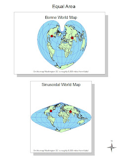
The bonne projection, which appears to have a similar shape to a heart, preserves the area of the map.  There is no distortion along the central meridian and all of the parallels have the same scale as the central meridian in concentric circles.  It is a pseudo conic projection with extremely distorted shape.  The sinusoidal projection also preserves the area via a pseudo conic projection.  There is no distortion on the central meridian or the equator, however the shape can be distorted especially near the poles.  The features in this projection are more concentrated together than in the GCS map, for example.

The equidistant conic world map, as indicated by its name, preserves distance and is crated by conic projection.  It has the same scale along all the meridians with a pacman shape to it.  Both area and shape are extremely distorted, it appears as though antarctica is slowly eating up the world while the other landmasses are clumped together.  The plate caree world map is a plane projection map with no distortion along the equator.  It preserves distance, however these two maps exhibit differing distances between DC and Kabul because they are not on the same meridian.  As they are slightly skewed, the distances are not equal. The map appears to be more elongated, as the continents are oddly wide and short.

Monday, May 2, 2011

Week 4 Lab

 This map shows the placement of schools within the county as well as an outline of where the noise pollution from the airport reaches.  This map attempts to solve the problem of figuring out which schools are effected by the presence of the airport and its noise pollution.  Thus the map indicates that funds to reduce noise distractions in schools only needs to be allocated to two schools as only two schools lie within the noise contour.


This map indicates what the land surrounding the airport is allocated for.  The graph indicates the amount of each type of land allocation that falls within the noise contour.  Since the graph indicates that a majority of the land parcels effected are agricultural, there is little worry that there will be a significant backlash from the surrounding community especially if there are plans to expand the airport.  However the problem, for example, of whether or not expansion that would lead to a larger noise contour would lead to backlash from the community is likely because there are few if any residential areas within the curent contour, however there is a great a deal of residential zoning in close proximity.


The newest map indicates the population density of the area.  The darker the green, the more dense the population.  This map allows the viewer to see population density in relation to the area around the airport as well as major roads.  This map could be used to see where there needs to be more roads or more frequent road maintenance because where the population is more dense, the traffic on the roads tends to be denser, resulting in traffic and worn roads.

The top map shows where a hypothetical extension of Airport Drive would be placed.  This solves the problem of where the road would extend to as it does not intersect with any existing landmarks.  The precise nature of the plan which takes into account a grid-like system as the road would be parallel to the existing roads.  This map lays out a distinct plan for the extension of Airport Drive.


This is a finished product of a set of data proposing how would be best to expand the airport.  The map gives the viewer a point of reference by making use of an extant rectangle.  The zoning and population information is taken into account as well as the information concerning school placement.  The noise contour follows the path of the runways, thus expansion of the runway system would also expand the noise contour.  Given the information it would make sense for the airport to expand either north or east, as the increase in the size of the noise contour would not have a large effect on residents of the area.

Monday, April 18, 2011

Lab 3


View Delicious Food Under $15 a Plate in LA County in a larger map


     The evolution of web 2.0 has made geography a major aspect of the lay man’s everyday life. From the ability to use GPS to get from one place to another while simultaneously having the ability to see gas stations and food stops on the desired route. One is also able to see the exact route through geographic imaging such as images on Google maps taken by both satellite as well as street view images taken by Google’s street image vehicles. Through these imaging options one may see the exact destination before one even leaves the house.
     While neogeography makes geographic systems more accessible to the general public through systems such as Google maps, one must by wary of the information supplied on the Internet. Since a great deal of information is supplied via volunteer sources, there is little to no incentive to supply information that is completely reliable. If the information has not been updated recently it may no longer be relevant. For example, construction may have altered the available routes. Faulty information may lead one to be lost.
     The easy accessibility of GPS in one’s car can lead to danger as a result of split attention between the GPS device and the road. Also, false information on the GPS can be dangerous as confusion concerning discrepancies between the GPS and the reality of the road can divert attention from the dangers of the road.

Monday, April 11, 2011

Lab 2: USGS Topographic maps


1.What is the name of the quadrangle?  
Beverly Hills Quadrangle
2. What are the names of the adjacent quadrangles?
    1. Canoga Park
    2. Van Nuys
    3. Burbank
    4. Topanga
    5. Hollywood
    6. Ocean
    7. Venice
    8. Inglewood

3.When was the quadrangle first created?
 
1966
4. What datum was used to create your map?  
North American Datum of 1927 and the North American Datum of 1983
5.  What is the scale of the map?   
1:24,000
6.   At the above scale, answer the following:
a. 5 centimeters on the map is equivalent to how many meters on the ground?   
1200 meters
b. 5 inches on the map is equivalent to how many miles on the ground?  
1.89 miles
c. one mile on the ground is equivalent to how many inches on the map?  
2.64 inches
d. three kilometers on the ground is equivalent to how many centimeters on the map?
12.5 cm
7. What is the contour interval on your map?
20 ft
8. What are the approximate geographic coordinates in both degrees/minutes/seconds and decimal degrees of:
a) the Public Affairs Building;
                  34° 4' 30"N 118° 26' 20" W

                  N 34.075° W 118.439°
b) the tip of Santa Monica pier;
                 34° 0' 27" N, 118° 29′ 59″ W

                N 34.00556° W 118.496

c) the Upper Franklin Canyon Reservoir;
                34°07'10" N, 118°24'37"W 
                N 34.119° W118.410°

9.  What is the approximate elevation in both feet and meters of:
                  a) Greystone Mansion (in Greystone Park)
  640ft
195.072 meters

b) Woodlawn Cemetery  
140 ft
42.67 meters

c) Crestwood Hills Park
620 ft
188.98 meters

10.  What is the UTM zone of the map?
Zone 11
11. What are the UTM coordinates for the lower left corner of your map?
3,763,000 meters N
362,000 meters W

12. How many square meters are contained within each cell (square) of the UTM gridlines?
1,000,000m2

13. Obtain elevation measurements, from west to east along the UTM northing 3771000, where the eastings of the UTM grid intersect the northing. Create an elevation profile using these measurements in Excel (hint: create a line chart). Figure out how to label the elevation values to the two measurements on campus. Insert your elevation profile as a graphic in your blog.


14. What is the magnetic declination of the map?
                  14 degrees

15. In which direction does water flow in the intermittent stream between the 405 freeway and Stone Canyon Reservoir?
                  the water travels from north to south
16. Crop out (i.e., cut and paste) UCLA from the map and include it as a graphic on your blog.